Building the System
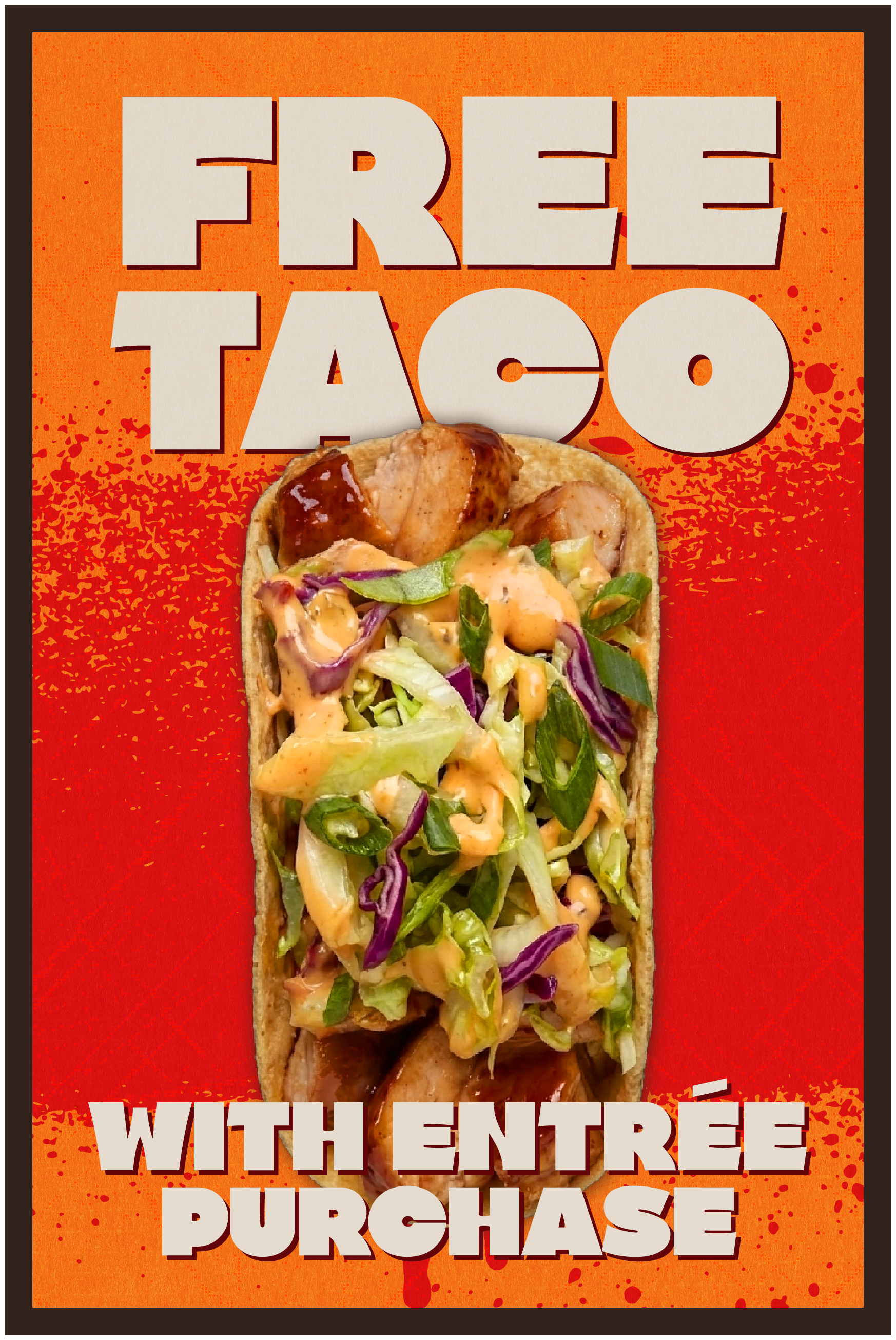
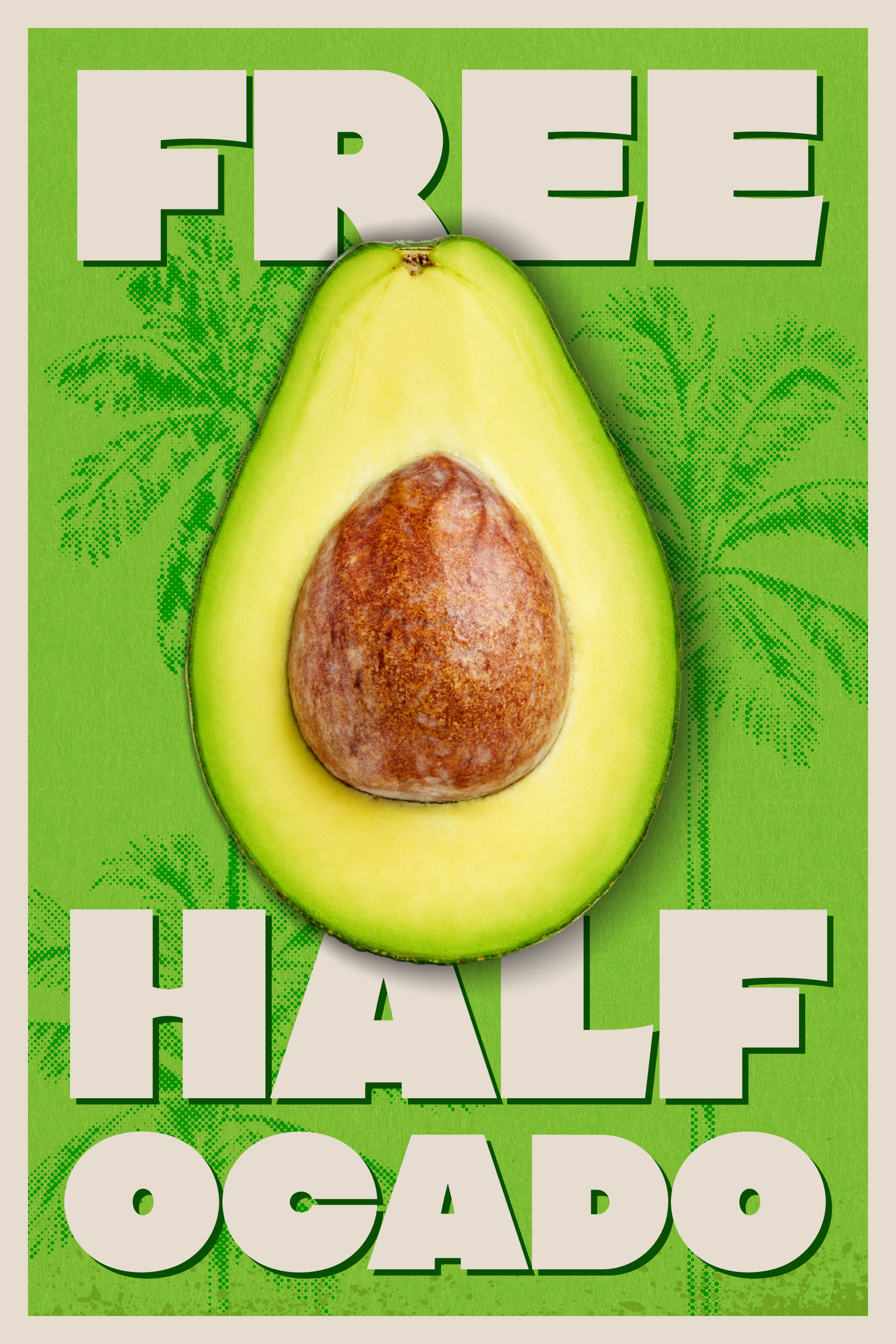
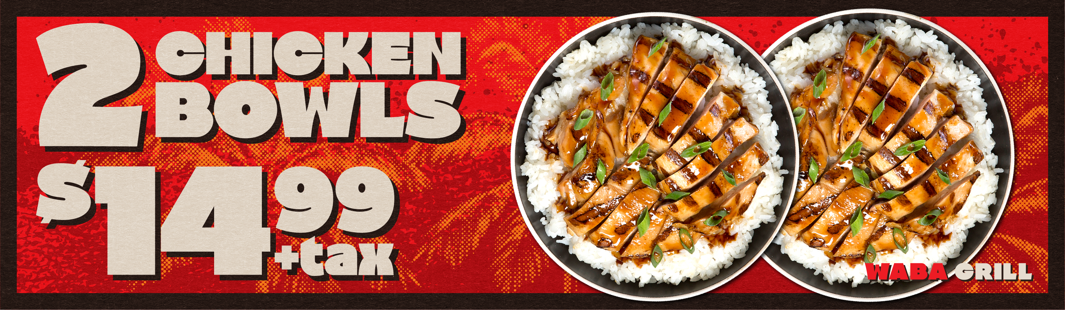
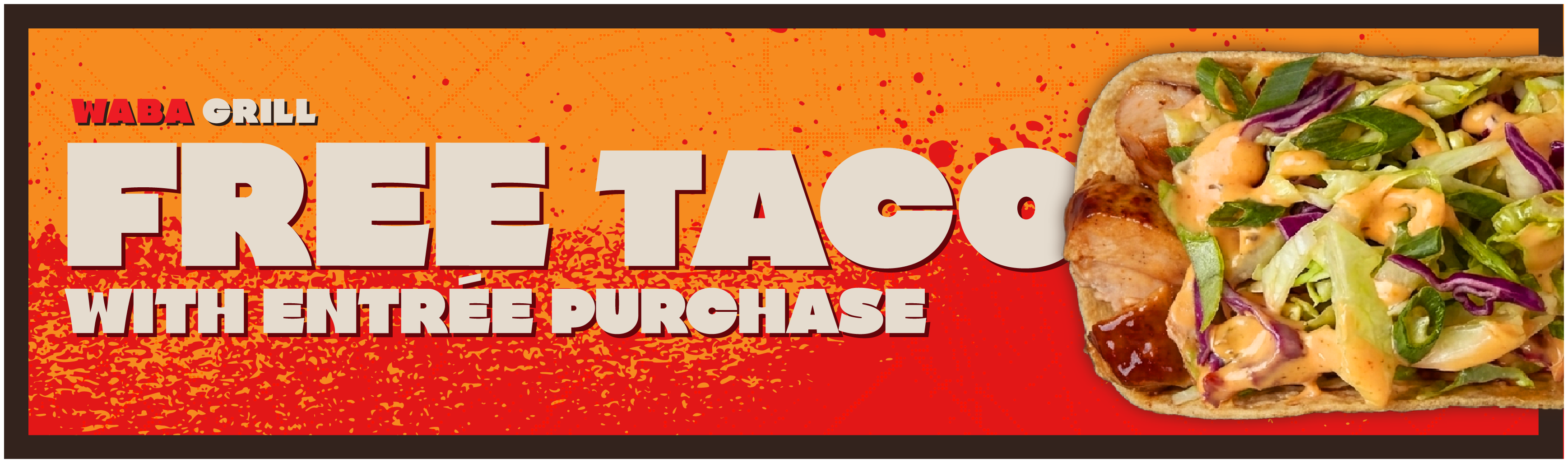
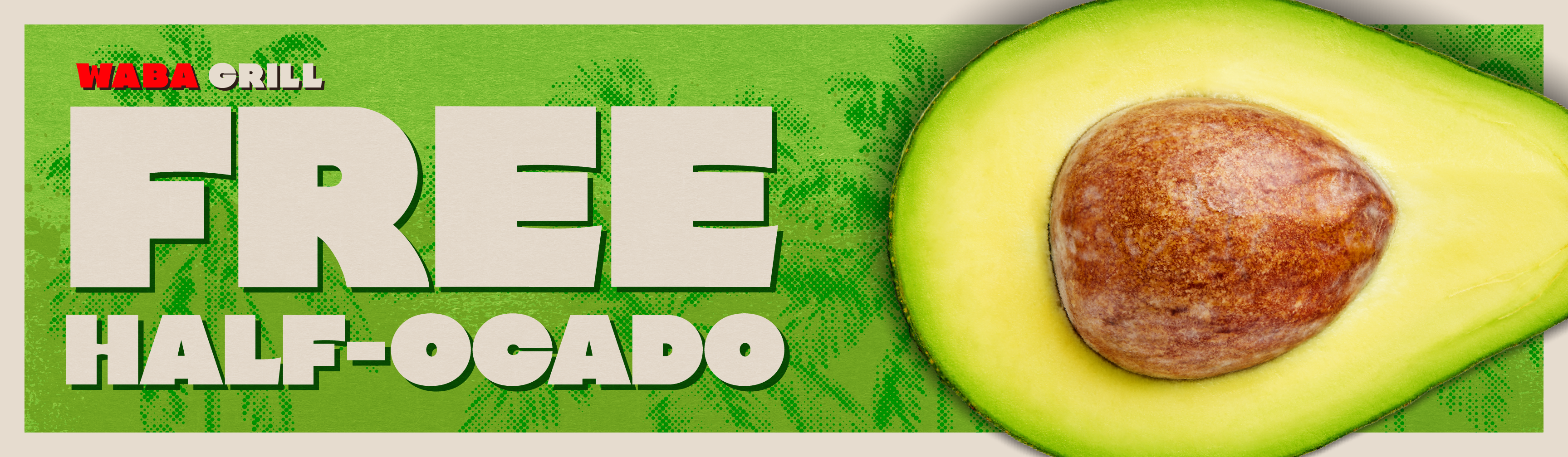
WaBa Grill’s visual identity needed to reflect a new brand genome: one that fused its Asian heritage with the energy of Los Angeles. This redesign pairs culturally significant Korean elements with iconic LA imagery, reworking typography and color into a bold, contemporary system. The result honors the brand’s origins while giving it a consistent, engaging presence across every platform.
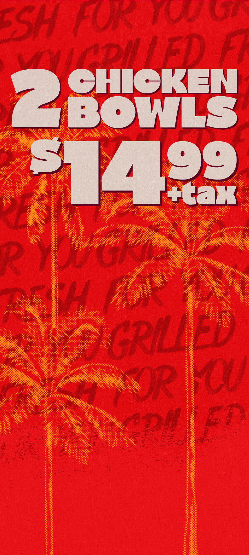
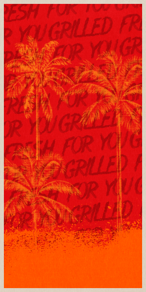
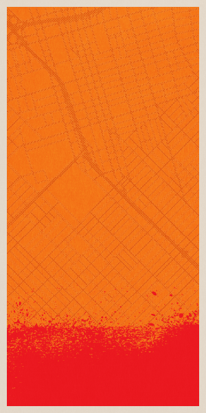
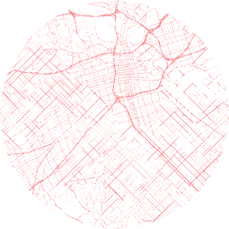
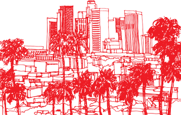
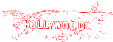
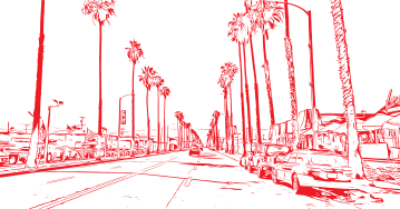
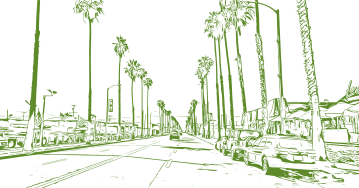
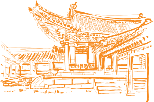
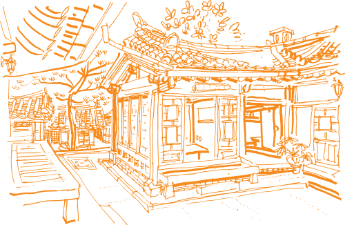
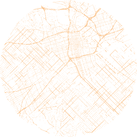
To bridge tradition and urban vibrancy, I built a multifaceted visual system. I designed custom Korean wordmarks for “delicious” and “fresh” and added hand-drawn illustrations of Korean architecture for depth. For the LA side, I sketched local landmarks and a stylized top-down map of the city’s streets. Textures like scanline noise, halftone, and spray-paint effects ground the design with a contemporary edge. Bespoke hand-drawn lettering brings the slogan “grilled fresh for you” to life in both English and Korean, unifying the whole narrative.
Color Overview






Grit & grain

Janeiro
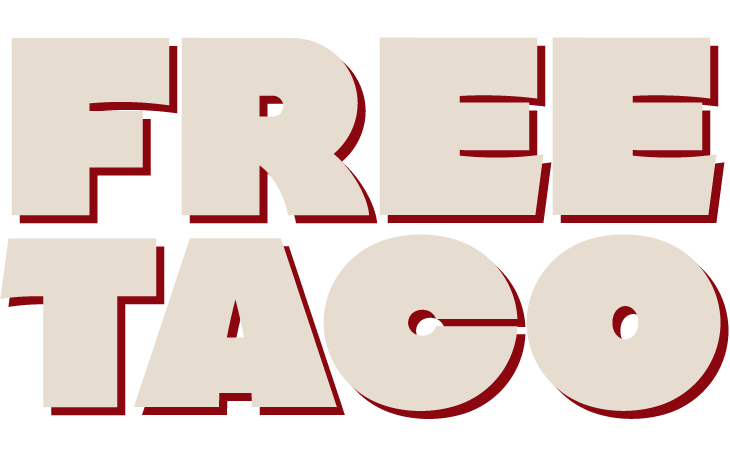
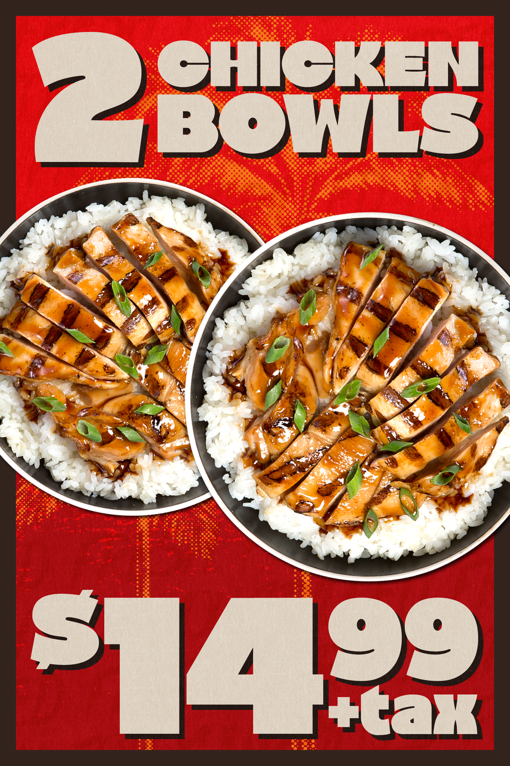
In updating the brand’s typography, I chose Janeiro as the primary typeface — modern, legible, and bold, mirroring WaBa Grill’s bold flavors. It establishes a strong visual hierarchy and clear communication across media, while Gibson carries the body copy.
Gibson



LA Original


For Real
comes
together