An Oasis in the Desert
Spotlight 29 Casino approached us during the development of their new resort and spa to design a new logo. The existing mark still read as a regional casino. It didn’t reflect the elevated resort-and-spa destination the property was becoming, and it didn’t speak to the mid-century modern design language and understated luxury the new experience was built around.
With a growing presence in the Coachella Valley, they wanted a mark rooted in its desert setting, and gave us the freedom to push it well beyond the existing look. What follows is the mark I designed.
The numbers “2” and “9” are hidden within each other. The viewer sees whichever they choose to focus on — a single form that holds both halves of the name without spelling either out. It rewards a second look, and works as a standalone icon long before any wordmark is read.
The sun pays homage to Spotlight 29’s desert heritage while doubling as a literal spotlight — a direct nod to the name. It also forms the top of both the “2” and the “9,” anchoring the figure with a shape that carries its own meaning.
The lower strokes read as desert dunes, refreshing water, or a mirage on the horizon — the same gesture read three ways. The kind of layered meaning that lets a simple mark carry the weight of a place.
Endless Possibilities.
The logo is built around a single mark that does more than one job at once — it reads differently depending on where the eye lands. Every element ties back to something true about the property: the desert it sits in, the spotlight in its name, and the number it has carried for years.
Built on a Fixed Grid
The mark is built on a consistent geometric structure. The sun’s proportions, the curve of the figure, and the spacing of the dune lines are all set to a fixed grid — so the symbol holds together at any size and reproduces cleanly across every surface, from a foil-stamped card to an exterior sign.
Colors
To present the mark in its element, I built a grounded palette around it — olive, beige, and dark stone. The tones are drawn straight from the property’s desert setting: sunbaked sand, native flora, and limestone. They let the logo breathe in a warm, understated environment rather than competing with it — the setting the mark was meant to be seen in.
Give it a Spin
In the World
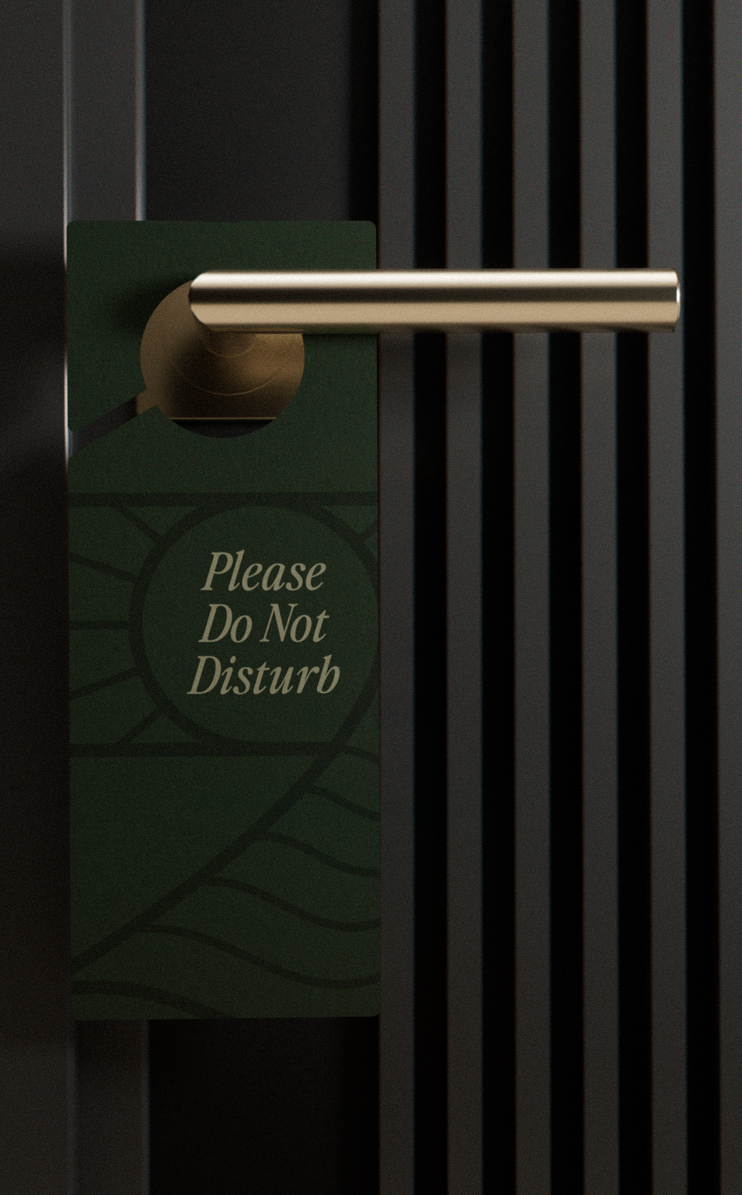
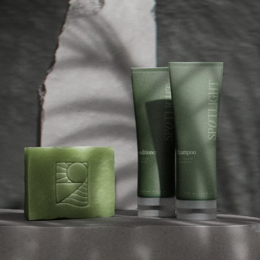
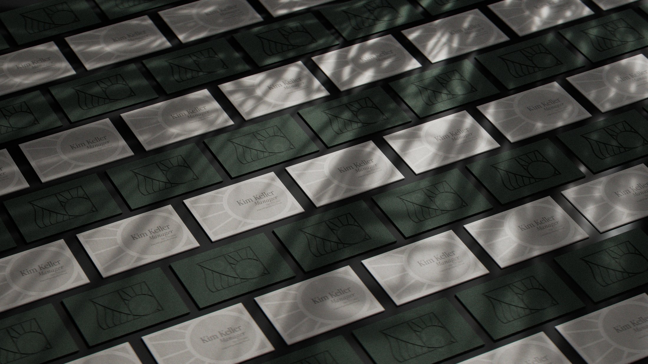
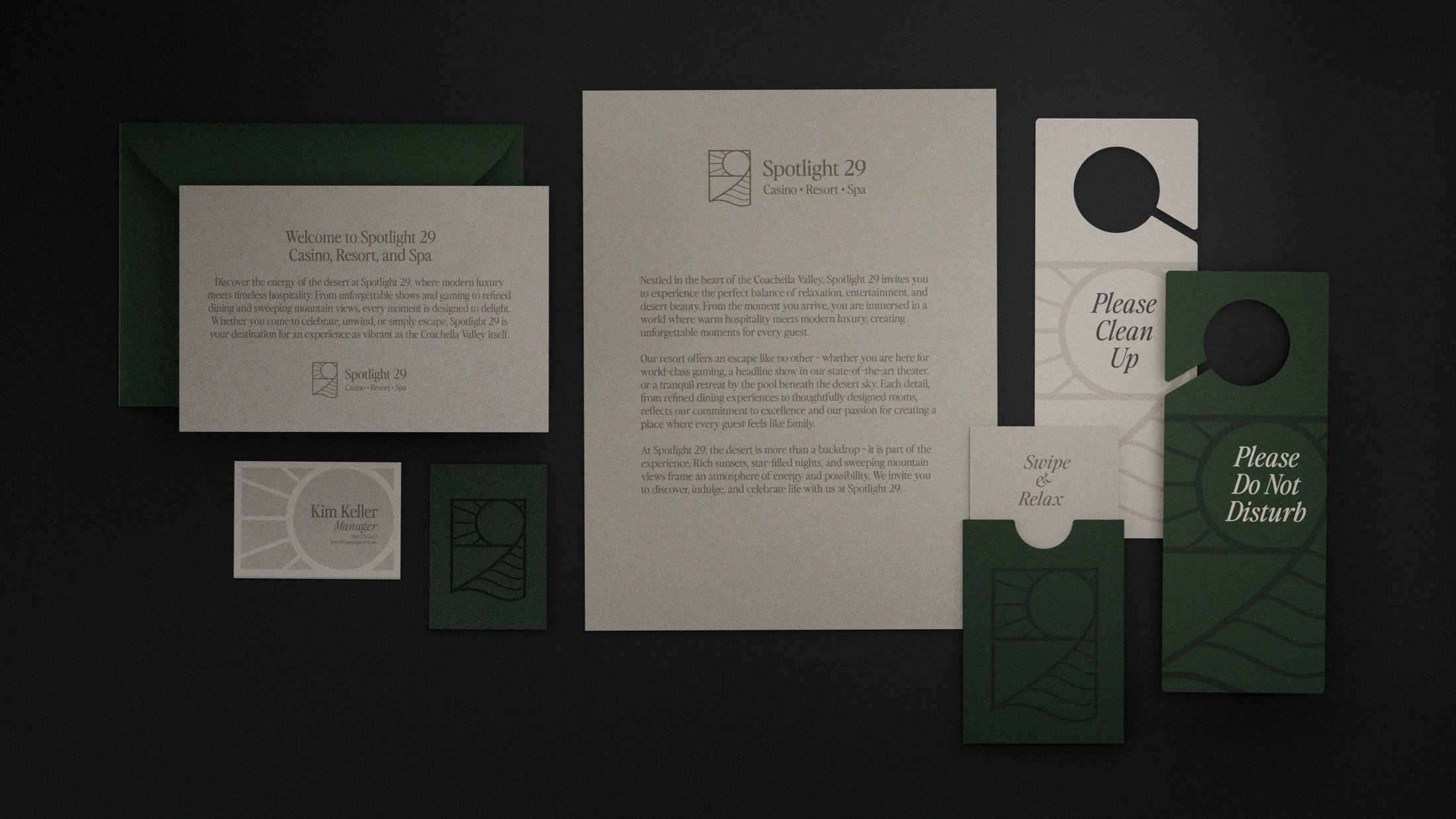
Rendered in three dimensions and placed into real materials and light — the mark holds its presence at every scale. Stamped small, lit large, read at a glance.
In Closing
A number, a sunrise, a desert, and a spotlight — all resolved into one form. The piece of work I’m proudest of: an idea where every part earns its place and points back to something real about the property. Proof that a single, carefully built mark can carry an entire brand without ever raising its voice.
